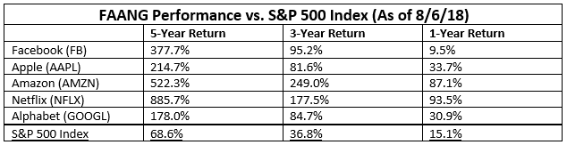
Investors and analysts alike often say the current bull market has been overwhelmingly driven by American technology giants Facebook, Apple, Amazon, Netflix, and Google (renamed Alphabet in 2015). The so-called “FAANG” stocks have indeed generated impressive performances, with each outperforming the S&P 500 Index over multiple timeframes.
The concern from investors has been that these companies’ staggering growth has led to a distorted marketplace in which only this handful of mega-cap technology stocks is keeping the bull market intact. Their fear is that if one of these companies falls on difficult times, it could bring the bull market, which is the longest in modern history, to a screeching halt. This is what occurred up until and after the dot-com bubble popped in 2000. In this report, we’ll investigate the claim that the FAANGs are the only companies propping the market up, and look at the overall health of the stock market. We’ll do that using two indicators that measure market breadth, or how many stocks are actually participating in the bull market.
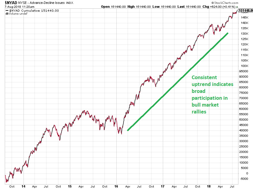
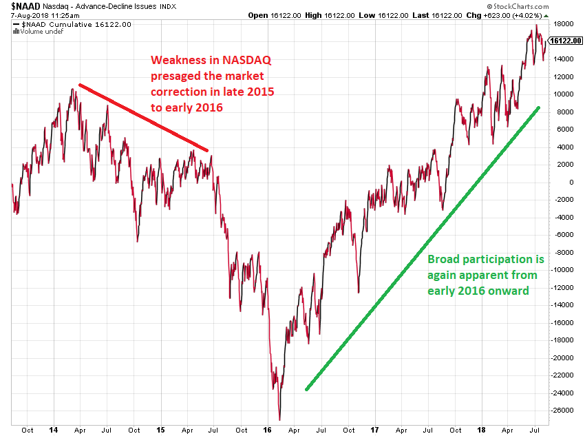
NYSE & NASDAQ Advance-Decline Lines
The Advance-Decline Line is one of the oldest and most reliable market breadth indicators available. Colonel Leonard Ayers is credited with having created this indicator in 1926. Its concept was simple: look at every stock traded and count the number of issues going up, then count how many are going down. In a strong market, more stocks will advance than decline, sending the indicator higher. In a weak market, an Advance-Decline Line will fall, because more stocks are decreasing in value than are appreciating. For our purposes here, a rising Advance-Decline Line indicates that the majority of stocks traded are climbing. At present, the Advance-Decline Lines for both the New York Stock Exchange (NYSE) and the NASDAQ are rising, and are at or near new multi-year highs. This would not be possible if only the FAANG stocks were supporting the bull market.
NYSE Advance-Decline Line
NASDAQ Advance-Decline Line
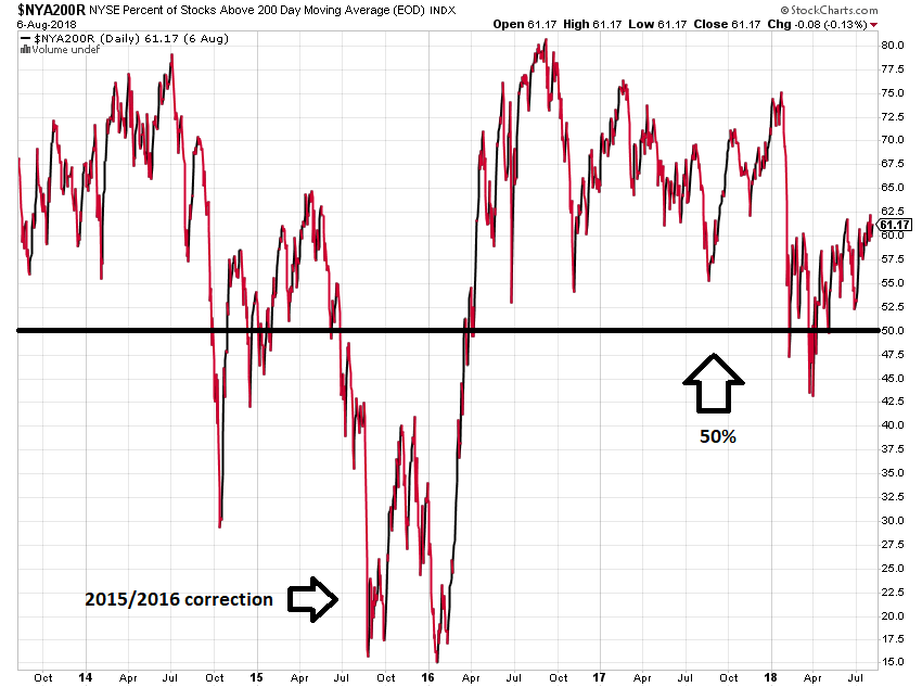
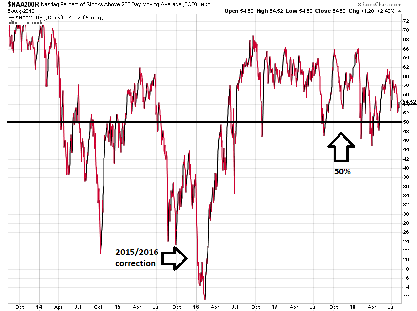
NYSE Percent of Stocks Above Their 200-Day Moving Average
A moving average can be used to track trends in individual stocks. When a stock is appreciating, its value will exceed its average value over the past 200 days. Generally speaking, we can say that if a stock’s value is greater than its moving average, the stock’s price is trending higher. See below for an example of how a moving average can be used to identify stock price trends.

By analyzing all of the stocks listed on the NYSE and the NASDAQ, one can gauge whether the majority of stocks are increasing or decreasing on an intermediate-term basis. If the majority of stocks are above their moving averages, that indicates a strong market supported by broad-based demand for many issues, and not just a select few, such as the FAANGs. An analysis reveals that the majority of stocks are and have generally remained above their 200-day moving averages for the past couple of years, suggesting the market is supported by healthy demand across the universe of publicly-traded common stocks.
NYSE Percent of Stocks Above Their 200-Day Moving Average
NASDAQ Percent of Stocks Above Their 200-Day Moving Average
These are just two indicators that show money is flowing into many stocks, and that the market is being supported by many more issues than just the mega-cap FAANGs. As the bull market continues to mature, it will be important to keep monitoring these and other indicators. If a time comes that only a small number of stocks are supporting the market, it will serve as an important warning sign of impending market weakness, regardless of whether the FAANG issues are included in that number. This will give us the opportunity to begin positioning portfolios in a more defensive manner to protect our clients’ assets. For now, however, our indicators continue to point to a bull market supported by strong breadth, which should lead to further new highs in the months ahead.